
Project Info – KurlOn
The target was to deviate from the conventional look and feel of a home furnishing store, and give the space a relaxing café like ambience. A top-notch place which is crafted such that the customer feels relaxed and welcomed as soon as they step in. The idea was to recreate spaces of a house with the products, to portray the feel of the actual look of the product in intended use. As the primarily product that the brand deals with is mattresses, various mock-ups of bed rooms were created, with side tables used for product description.
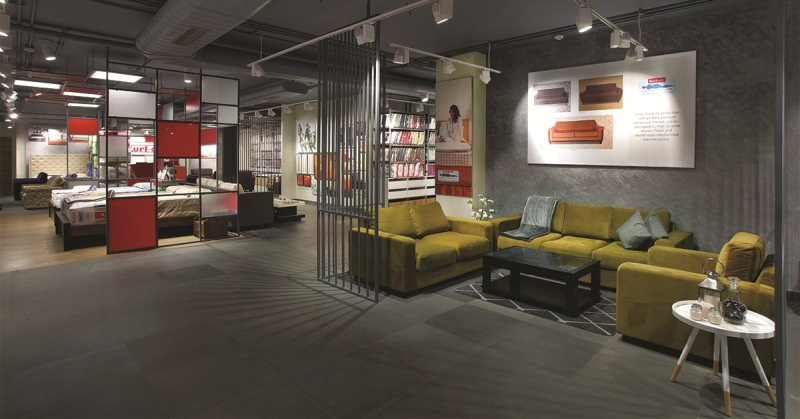
The brand needed a design that would be iconic for it, a design that will consequently spread all over India, acting as a catalyst to its business expansion plans. To create a premium setting for a brand that deals in mattresses, pillows, bedsheets etc. needed the right fix of display units and mock-ups. Everything in the store strives to achieve an ambience of quite elegance. The focus is however, undeniably the metal grid elements, designed in the brand colours used to demarcate specific areas for the various mock ups.
The raw grungy feel added to this via the combined use of metal grids, fixtures and a subtle colour palette, accented by the brand’s iconic imagery. The interestingly shaped cash counter with the visual timeline portraying the success of the brand over time is another innovative addition.
To bring out the best in the merchandise, moveable track lights which enhances the focus on the products were used. The lighting solution added a whole new experience to the space, creating a relaxed mood in the store. Metal grids hanging from the ceiling, have 2’x2’ LED light fixtures, which are a major part of the design character. The colour palette was chosen such that the brand identity is re-enforced. Where else, flooring is a combination of grey concrete with wood acting as highlight. The marble finish in the walls further added to the cool, sheen look.
The otherwise subtle setting of the store is challenged by the vibrant red colour used tastefully to create an impression that lasts in the customer’s mind-set even after they leave the store. This red and white combination is a brand identity for Kurl-on that the design has successfully amalgamated into its interiors. Large product visuals at various location with focused lights are great spaces for advertisement.
The store has a very interesting display unit for the display of mattresses. This fixture which has a capacity of six, is designed such that each mattress can be pulled out, and rotated to display the mattress horizontally like a bed for the customer’s inspection. 8’ height display units for the top of bed products, made the customer’s experience very convenient.
The store layout is planned to facilitate a consultative engagement, distinctly differentiated from a transactional one, with the customer both visually and in person. The attention to details and the innovative fixtures used for the display of the products give the space a high-quality premium setting which echoes the brand’s emphasis on superior product standards. Ceiling and exposed services have been kept dark in colour to restrict the visual connection up till the eye level. The retail experience allows the brand to scale up to a Home Décor comfort category brand. It’s the journey that matters!